Colourful Summer Capsule Wardrobe

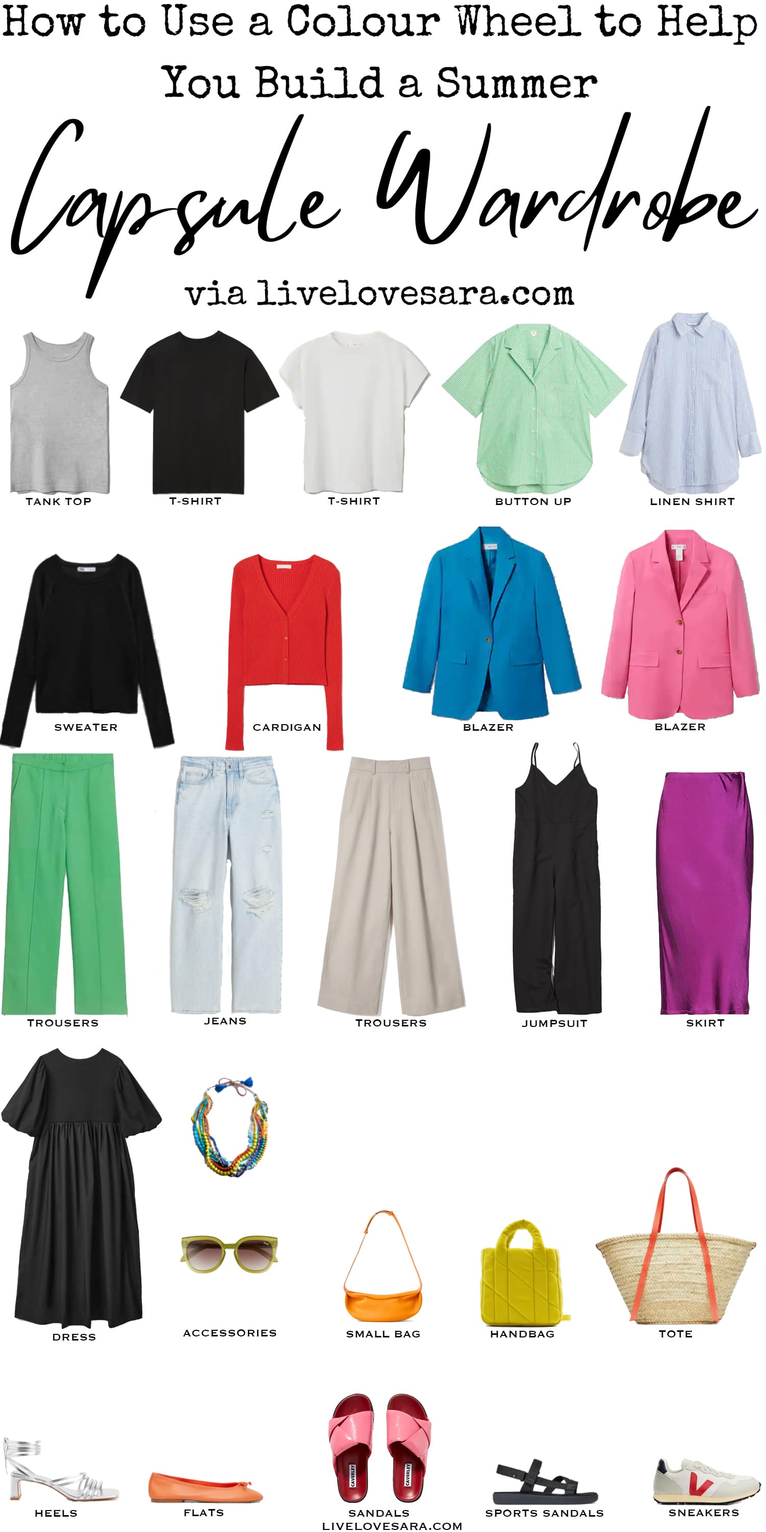
Tank Top | Black T-shirt | White T-shirt | Green Button-up | Linen Shirt | Black Sweater | Red Cardigan | Blue Blazer | Pink Blazer | Green Trousers | Jeans | Tan Trousers | Linen Jumpsuit | Magenta Skirt | Black Dress | Necklace | Sunglasses | Orange Bag | Handbag | Tote | Silver Heels | Orange Flats | Pink Sandals | Sports Sandals | Sneakers
It has been proven that during times of crisis and uncertainty we go back to colours that are darker and more neutral, while in times of economic prosperity and peace, we choose colours that are brighter.
It has been a rough 2+ years, and that is also reflected in our wardrobes.
Very simplistic, neutral clothes have been at the forefront, while brighter colours have been hard to come by.
Until recently.
We are seeing a lot of bright colours in stores now because the colour forecasters have decided that we need to switch directions.
So if you are scared to add some colour to your wardrobe, I am going to give you a lesson on how to use a colour wheel to help you build a capsule wardrobe.
While today’s post focuses on a summer capsule wardrobe, these lessons can be used at any time of the year to aid you in selecting some pretty damn neat colour combinations.
First, we are going to talk about what the colours are and how they work.
The Primary Colours are the main colours of red, green, and blue. They cannot be made by combining other colours.
If you are an artist or painter, you may be saying what? I thought the primary colours were red, yellow, and blue which is correct for pigments. I am referring to the science of colour, which is a bit different.
This is why computer monitor’s colour displays are listed as RBG.
When these colours are mixed, they produce the Secondary Colours of magenta, cyan, and yellow.
Still with me?
A Hue is a term for the family name of a colour.
If we add white to a hue we get a tint, but if we add black to a hue we get a shade. And then to make it even more confusing, when we add grey to a hue we get a tone.
Black, white, and grey are achromatic, but in the fashion world, we call them neutrals.
They don’t have a hue, but they bring harmony with one another, as well as with other colours.
This is why it is so important to have a decent amount of neutrals in your wardrobe. They can tie everything together, especially if you are venturing out into intense colour combinations.
Which I hope you are willing to try by the end of this.
In many instances depending on what they are paired with, pastel colours can be neutrals. I wrote a post on neutral pastels and how to mix light and dark outfits that may be useful.
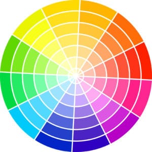
So we have our primary and secondary colours and when we combine those together we get our Tertiary Colours, like green mixed with blue, or green mixed with yellow.
These both give greens, but you can see how the Tertiary work on the colour wheel I provided.
Other colour wheels can give you more in-depth colour variations, but I had to work with what I could find. This was the best option that I could get off of a paid photo site.
I don’t want to upload anything that belongs to someone else. You can order more detailed colour wheels on Amazon.
This rounds out the base of a colour wheel. but as you can see, in each colour wedge we have different tints, shades, and tones, of the colours when white, black, and grey are added.
These groupings are how you are going to help how you look at your wardrobe.
Ready?

How to Use Colour Schemes in Your Wardrobe
The easiest is monochromatic. This is when we stick to one hue in either an entire outfit, part of, or the main part of a print. If we are opting for this, then make sure any other colours are neutral.
Wearing head to toe one colour may feel boring, but depending on the time of year, you can add some visual interest by using different fabrics, knits, and textures.
Then we move on to tone on tone, or we often call it tonal dressing. This is when you combine different hues that are next to one another on the colour wheel.
These work together easily because they have a hue in common, therefore are harmonious.
Analogous colours are a grouping of anywhere from three to five colours that are adjacent on the colour wheel.
For the sake of ease, we will go with three. These colours work because of the underlying hues that they have in common.
In fashion they like to go with a 60-30-10 rule which means 60% is the main hue, then 30% of another, and add a pop of colour with 10%. This can easily be done with shoes, or accessories.
For example, blue works well with both teal and green.
Analogous colour schemes are often seen in nature because they are harmonious. The yellow, yellow-orange, orange, orange-red, and red leaves in fall for example.
Now we are getting into the big ones.
The ones that tend to scare people.
We will start with Complementary colours. This is the boldest choice.
This colour scheme involves two hues that are opposite one another on the colour wheel. The most famous example of this is red and green.
This look can be pretty intense, so it is common to vary shades, tints, or intensities instead of going straight up Christmas.
Split Complementary which is one of my favourites, uses one hue and then looks to the hues that are adjacent to its complementary
This can be less bold and easier to wear, but still, quite eye-catching. Blue as the main hue, red and yellow as the split complementary (not purple-blue, but the lighter, more intense blue of the blazer I included).
This same blue and orange would be considered complementary to one another.
Yellow-green and pink are complementary, and yellow-green, with red, or purple-pink are split complementary.
The more complicated colour schemes are Double Complementary which are the two colours on either side of a hue, and two on either side of its complement.
That’s a lot of colours at play, though.
A Triad contains hues that are equidistant on the colour wheel. A good example of that are the primary colours which we often see used in children’s toys.
Or at least we did a long time ago. People like neutral coloured toys now for some reason.
The final colour scheme is the most complicated, and you probably won’t use it. It is called a Tetrad or double split compliment. Tetrad is easier.
This uses four colours that are equidistant on the colour wheel. This means that it forms a rectangle on the colour wheel.
You would not use this combination in equal proportions. It would be too much. The best option would be to focus on one hue and add the others in smaller quantities.
That was a lot of information to process and I hope that I didn’t confuse you too much.
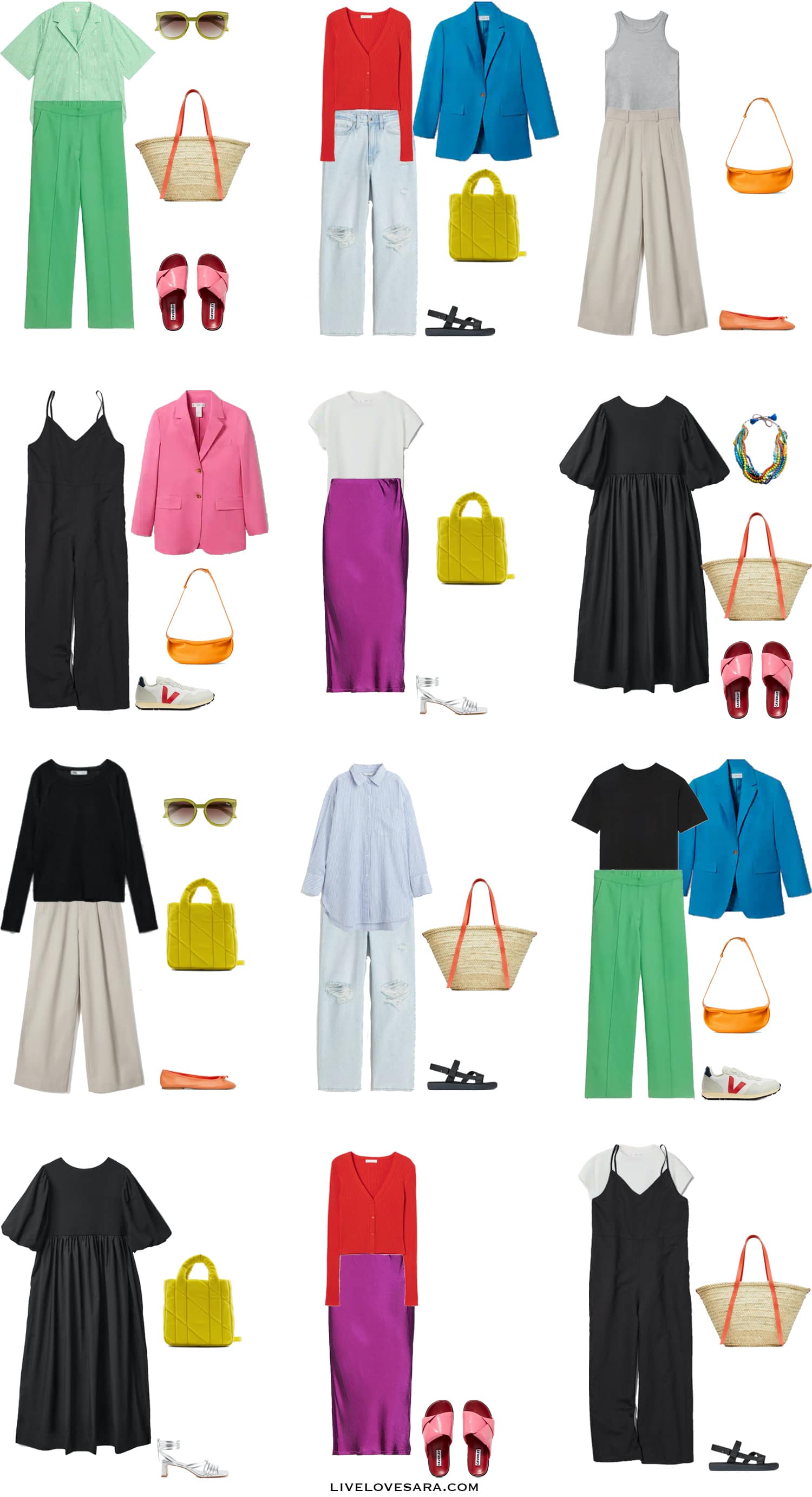
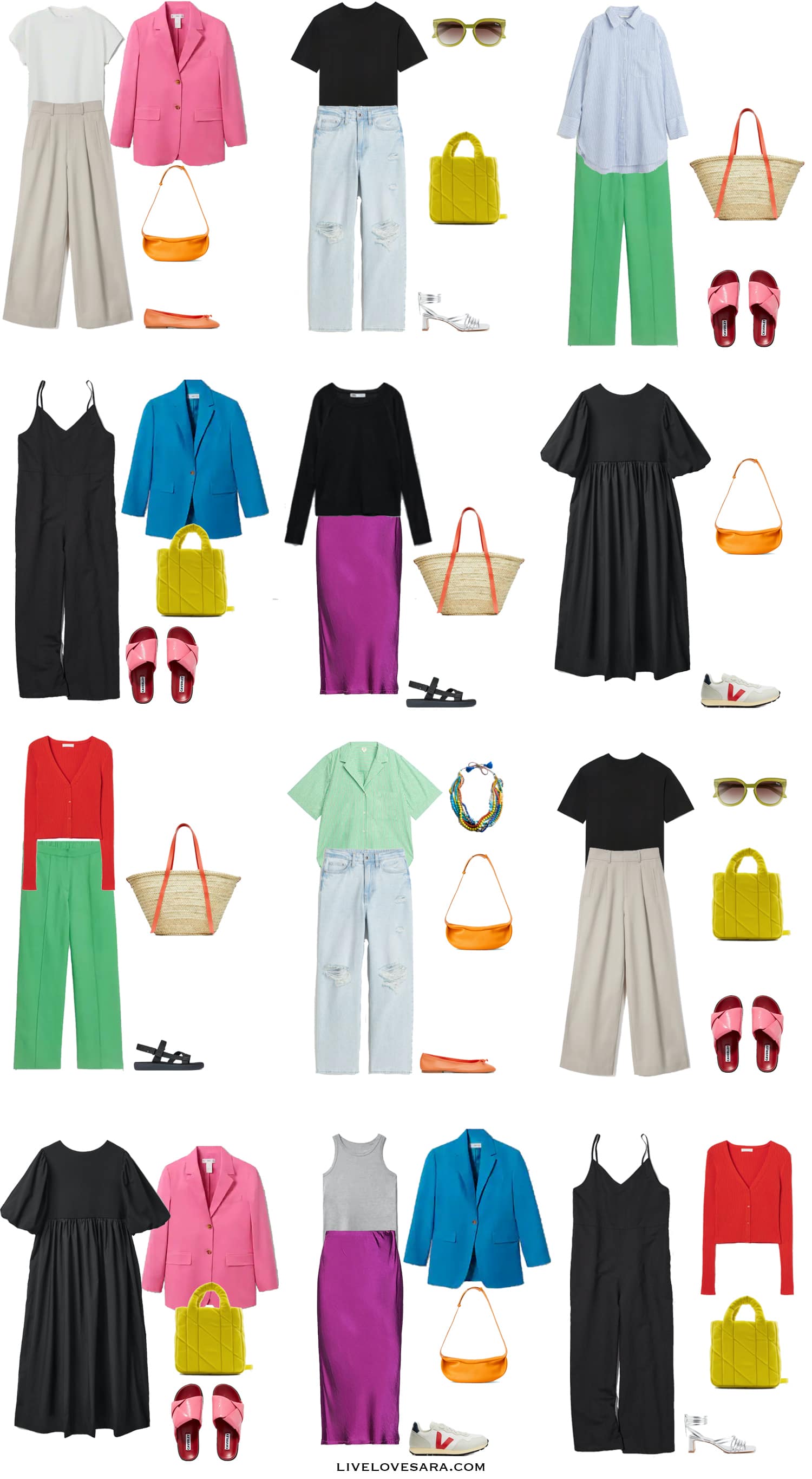
In this summer capsule wardrobe, I focused mostly on complementary and split complementary colour schemes.
I also sprinkled in enough neutral to build good foundations. And yes, in fashion jeans are considered neutral because you can wear them with anything.
So if you are looking to add some colour into your wardrobe, then I hope that this post helped to make things a bit clearer.
If you are scared to break out of your neutral then start small.
Choose one hue that you really like and choose the complementary or split complementary colours to go with it.
For example, add a blue blazer, and choose some accessories, a bag, or shoes in colours like orange, red, and yellow. Or a pink blazer, and add green, and yellow. Colours that not only work together but also compliment the blazer.
Or you can scrap the rules and just have fun with it.
Because fashion is supposed to be fun and rules are meant to be broken.
Stay safe.
Cute Summer Outfits

Casual Summer Outfits for Women

Tank Top | Black T-shirt | White T-shirt | Green Button-up | Linen Shirt | Black Sweater | Red Cardigan | Blue Blazer | Pink Blazer | Green Trousers | Jeans | Tan Trousers | Linen Jumpsuit | Magenta Skirt | Black Dress | Necklace | Sunglasses | Orange Bag | Handbag | Tote | Silver Heels | Orange Flats | Pink Sandals | Sports Sandals | Sneakers
SHOP THE UK LINKS
This post contains affiliate links. By using my links to shop I may receive a small commission (at no cost to you). Thanks for supporting what I do


Love it!
Hi….I know this is an older post but it’s sooooo good. Thank you! Gotta go down the rabbit whole on your Blog now….see ya bye
Thanks! Even though it’s older colour theory doesn’t change so you can still apply these concepts when getting dressed. I hope you find some useful information here! – Sara