I have a love-hate relationship with spring. Right now, I am battling with myself on what pieces will be my spring go-tos, which has led to a lot of thinking about what I look for in a spring outfit.
To me, there is a certain kind of spring outfit that always feels more interesting than the rest. It isn’t one that is super loud or overly styled, and it doesn’t rely on trends to do the heavy lifting.
Because we should never rely on trends to do the heavy lifting in our wardrobes.
I digress.
The spring outfits I am drawn to usually look intentional but relaxed, a little off in a way that feels confident rather than messy.
You get the sense the person wearing it didn’t crowdsource their choices; they just know what they like.
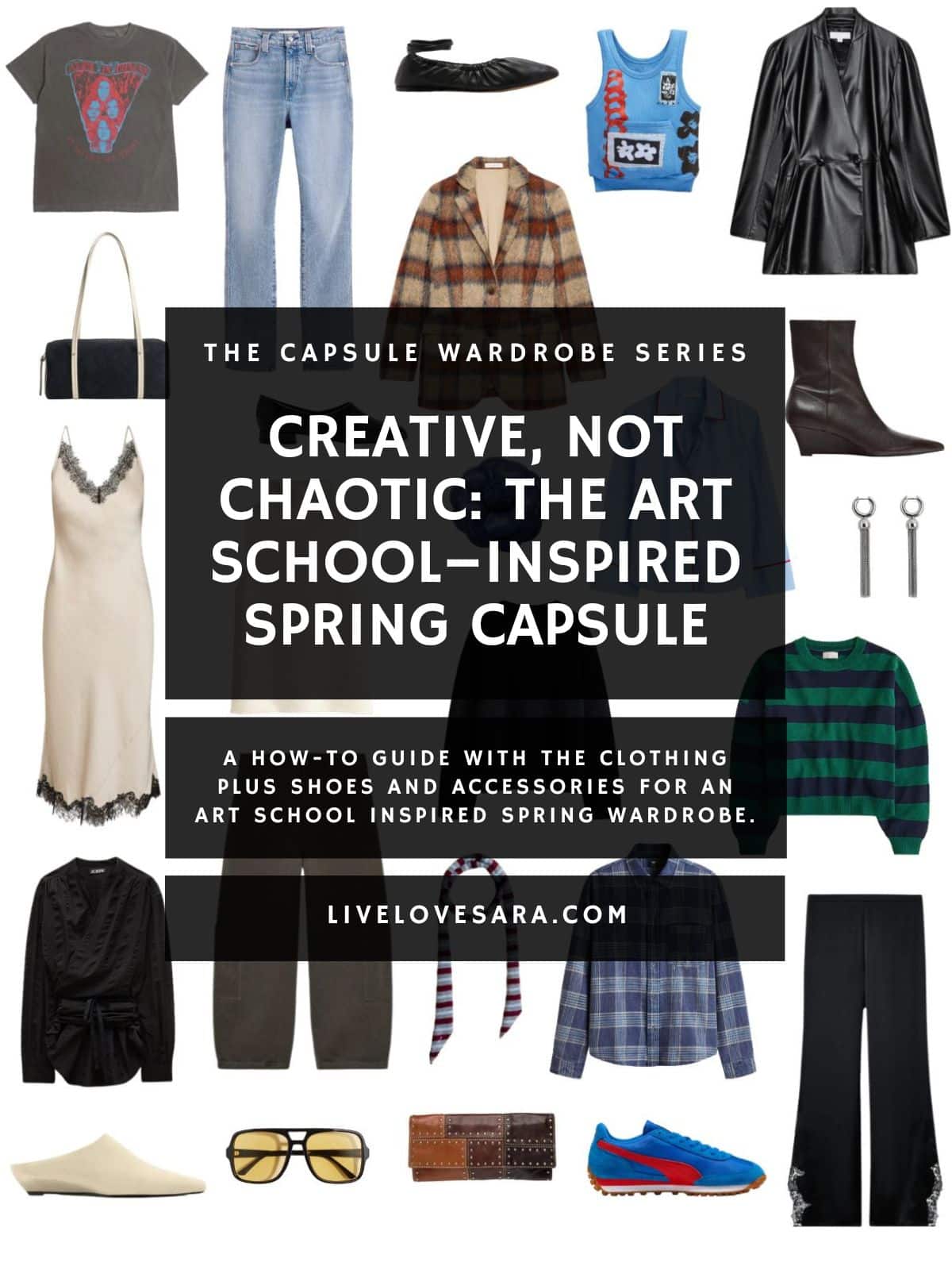
I took the energy that draws me to those outfits and put it into this art school–inspired spring capsule.
Not the chaotic, thrift-store-on-steroids version. And not limited to black turtlenecks and paint-splattered jeans that I am guilty of either.
What can I say, I love a paint-splattered pair of jeans.
This version is less ironic layering, or the “look how creative I am” vibe and more grown-up, wearable, and chic, with just enough creative tension to feel interesting.
And importantly, it makes room for colour. Not clashing chaos, not every shade at once, but bold, deliberate colour used as part of the composition.
What “Art School Style” Really Means and What It Doesn’t
Spring is when overly neutral wardrobes start to show their cracks. Heavy winter layers are gone, and suddenly outfits have to stand on their own.
It is almost like you are standing there naked after months of bundling up.
When everything is beige, grey, or black, the simplicity can tip into flatness. Not wrong, just a little uninspired.
This art school wardrobe isn’t about dressing loud. It’s about thinking visually.
The best art school outfits tend to feel instinctive rather than assembled, relying on proportion, texture, repetition, and contrast more than trends or obvious statements.
There is a confidence that comes with restraint, and a willingness to wear something slightly unexpected without turning it into a spectacle.
What it is:
- Intentional but relaxed
- Creative without being busy
- Personal rather than performative
What it’s not:
- Maximalist chaos
- Ironic layering for the sake of it
- An excuse to throw everything on at once
This is art school energy filtered both through experience and a clear sense of taste.
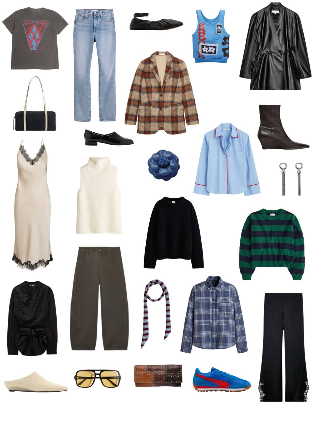
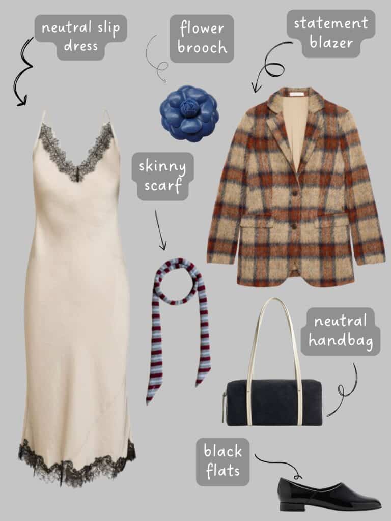
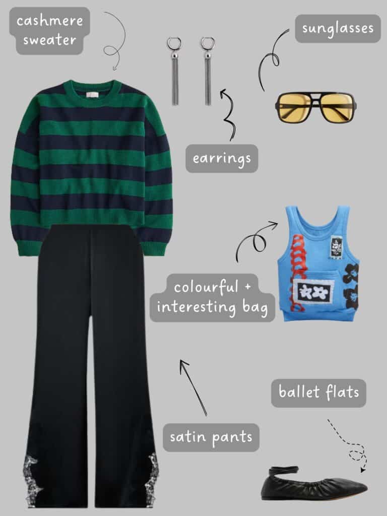
Alice in Chains T-shirt | Blue Jeans | Ballet Flats | Plaid Blazer | Blue Bag | Leather Jacket | Wedge Boots | Earrings | Blue Pyjama Style Shirt | Flower Brooch | Black Block Heels | Black Handbag | Slip Dress | Sleeveless Turtleneck | Black Sweater | Striped Sweater | Plaid Shirt | Skinny Scarf | Cargo Pants | Black Wrap Shirt | Mules | Sunglasses | Clutch | Sneakers | Satin Pants

The Art School Capsule Framework (Chic Edition)
Rather than a checklist, think of this capsule as a visual system.
A Calm Foundation
You still need grounding pieces. These don’t have to be all black, but they should feel steady and repeatable, colours you can wear day after day without thinking too hard.
Think: deep navy, charcoal, cream, olive, soft grey, chocolate brown.
These shades give your bolder pieces somewhere to land.
One or Two Bold Colours Chosen on Purpose
Here’s where this capsule diverges from minimalism.
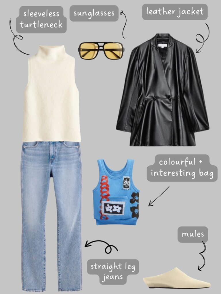
Instead of sprinkling colour everywhere, you choose one or two strong hues and let them recur. For me in this wardrobe, the colour was blue.
A bold knit worn casually. A colored shoe will ground an otherwise simple look. A strong shade layered into an outfit that’s otherwise restrained.
This repetition is what keeps things chic rather than chaotic.
Good art school, leaning choices for spring:
- Red (tomato, oxblood, or brick)
- Cobalt or inky blue, or any blue really
- Grass or bottle green
- Butter yellow or chartreuse (used sparingly)
The rule, if there is one, is this:
Colour should feel integrated, not decorative.
The mistake people often make with creative dressing is assuming more is better. More layers, more colours, more ideas.
But what you want is a wardrobe that is edited. One that understands that one unexpected element is usually enough, and that everything else should support it.
Relaxed Structure
This is also why spring tailoring works so beautifully here.
This style lives in pieces that suggest structure without enforcing it:
- Oversized shirts
- Slouchy blazers
- Long coats worn open
- Fluid trousers
Nothing should feel tight, fussy, or like you can’t get it dirty. Ease is part of the aesthetic.
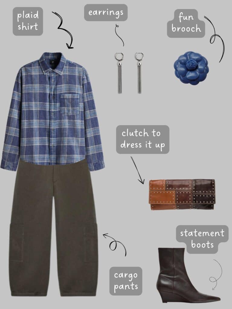
In this capsule, I added a men’s plaid shirt in a worn wash for a relaxed and “I’ve worn this piece a million times” vibe.
I actually bought this shirt the other day during a flash sale. I also got the red version, and I absolutely would have bought the green too if it were available in Canada.
It is that good.
It is like the flannel shirts from the 90s that you stole from your dad and wore the shit out of, and exactly what I have been searching for unsuccessfully until now.
Let’s continue.
Texture Over Print
Texture plays a quiet but important role too.
Cotton, linen, denim, silk, knits, soft leather, these materials add depth without visual noise.
They soften bold colours and make outfits feel lived-in rather than assembled for effect.
Shoes That Anchor the Look
Footwear matters here. In an art school–leaning wardrobe, footwear grounds everything.
It adds weight, intention, and balance. Even when the outfit is simple, the right shoe keeps it from drifting into blandness.
How to Wear Colour Without Creating Chaos
Wearing colour this way is less about bravery and more about composition.
A strong hue works best when it appears more than once, or when it’s paired with simple shapes that let it breathe.
A neutral outfit becomes a canvas rather than a default. The result feels graphic, thoughtful, and surprisingly easy to repeat.
And repetition matters.
It is about wearing the same ideas again and again, just slightly differently each time.
That’s where confidence shows up, not in constant reinvention, but in familiarity.
A few guiding thoughts:
- Let one colour show up more than once
- Pair bold colour with simple shapes
- Use neutral outfits as a canvas, not a default
A Note on Colour and Why This Works Without Feeling Chaotic
What keeps colour from tipping into chaos here is structure.
In art and design, colour works best when it’s repeated and given space, and the same logic applies to clothing.
When one bold hue appears more than once, even subtly, the eye reads it as intentional rather than random.
This idea shows up across very different design languages, from the disciplined colour restraint of Phoebe Philo at Céline to the more conceptual work of Rei Kawakubo at Comme des Garçons, where colour often appears sparingly but with enormous impact.
In both cases, colour isn’t decorative, it’s compositional.
In this art school–inspired wardrobe, the same principle applies: bold colour is grounded by familiar silhouettes and restraint elsewhere, giving the eye somewhere to land.
That’s what allows an outfit to feel expressive without being overwhelming, and creative without losing its chic edge.
Art School Outfit Formulas (Creative, Not Costumey)
These aren’t instructions. They are patterns you’ll start to notice once you lean into this style.
Neutral Base + One Bold Element
A calm outfit: trousers, knit, a simple layer interrupted by a strong colour. The rest stays quiet, so the colour feels intentional, not loud.
Monochrome with a Colour Accent
All navy, all grey, or all cream with a single colour moment. Clean, graphic, and very chic.
Relaxed Tailoring + Unexpected Colour
A blazer or structured piece paired with something expressive like a bold knit, a coloured shoe, or an unusual shade worn casually.
Soft Volume + Sharp Detail
Loose silhouettes grounded by a sharper element: a structured bag, a heavier shoe, or a strong colour choice that brings focus.
Why Secondhand Fits This Capsule Perfectly
Secondhand pieces slip naturally into this kind of wardrobe.
Clothes with a bit of history soften bold choices and keep outfits from feeling too polished or new.
Older tailoring, worn-in denim, knits that have already relaxed all add credibility without trying to be interesting.
Secondhand and vintage pieces:
- Soften bold colours
- Add depth to simple silhouettes
- Prevent outfits from feeling overly styled or new
What I Wouldn’t Buy for This Capsule
This is where restraint matters most.
What doesn’t belong here are pieces that feel clever but impractical. Overly trendy “arty” items that only work in theory.
Too many colours competing for attention.
Anything that feels like it’s wearing you instead of the other way around.
An art school capsule works best when it feels instinctive. When outfits look like they came together naturally, even if there was thought behind them.
The goal isn’t to look creative. It’s to feel expressive in a way that still feels chic and grounded.
At its core, this way of dressing is about creative restraint.
Knowing when to add interest and when to let things stay quiet. Letting one bold choice carry the outfit instead of forcing every piece to speak.
If you’re craving something more expressive this spring, but don’t want to lose your sense of calm or cohesion, this is a middle ground worth exploring.
Creative, but composed. Interesting, but chic. Art school energy, but grown up.
Sometimes the most stylish move is choosing one unexpected element and trusting it to be enough.
Art School-Inspired Spring Outfits

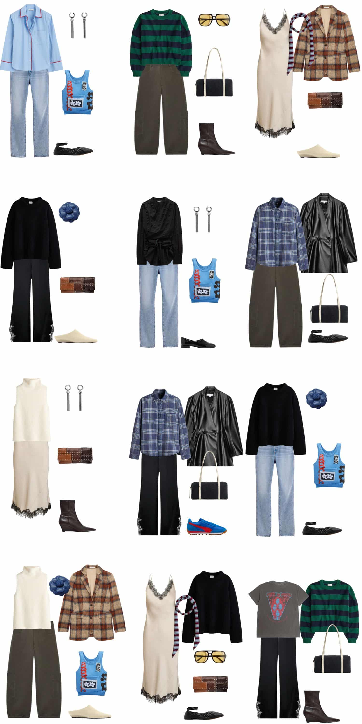
Alice in Chains T-shirt | Blue Jeans | Ballet Flats | Plaid Blazer | Blue Bag | Leather Jacket | Wedge Boots | Earrings | Blue Pyjama Style Shirt | Flower Brooch | Black Block Heels | Black Handbag | Slip Dress | Sleeveless Turtleneck | Black Sweater | Striped Sweater | Plaid Shirt | Skinny Scarf | Cargo Pants | Black Wrap Shirt | Mules | Sunglasses | Clutch | Sneakers | Satin Pants
SHOP THE UK LINKS
This post contains affiliate links. By using my links to shop I may receive a small commission (at no cost to you). Thanks for supporting what I do 
