Colours for fall? Groundbreaking. Fall fashion tends to shift past the colourful spring and summer styles and focus on the earthy and deeper tones which is often my preference, but incorporating interesting bold and bright colours is something that I like to do all year long to keep things fresh and fun.
Neutrals are a default for many because it is easy and safe.
Oftentimes, people are hesitant to dress in a colourful wardrobe many of which stem from a fear of standing out or drawing too much attention.
Wearing bold, bright colours, in a carefree way can make us feel like everyone is looking and judging which can be uncomfortable, especially for those who prefer to blend in or stick to more understated styles.
Experimenting with colour can be challenging to know how to pair hues in a way that feels cohesive and stylish.
This can give us a fear of making a “fashion mistake”. I put that in quotes because I often find that the most interesting outfits are comprised of pieces that technically don’t go together.
Some people worry that different colours won’t suit them or in the corporate world of neutrals, they think they won’t be taken seriously.
We have also grown up with the idea that dark, neutral shades like black, grey, and beige are timeless and slimming, making people more comfortable sticking with these safer choices.
So when it comes down to it, the fear of judgment or not getting it “right” can make many shy away from incorporating vibrant colours into our wardrobe, even when we secretly admire them on others.
We saw a lot of colours, colouring mixing, and colour blocking at the recent fashion shows which shows me that the pendulum is swinging from the more neutral based outfit, to something more vibrant.
Like when we went from the colourful 80s to the minimal and understated 90s.
So to prepare you for this I am going to try to break it down today in easy ways to think about colour and adding colour to your wardrobe.
You don’t need a deep understanding of colour theory to wear colour because the colour wheel, which I will explain in detail below will help you with that.
Yes, colours might take a bit more thought than the grab-and-go mentality of an all neutral wardrobe, but playing around and trying new combinations is what makes fashion fun.
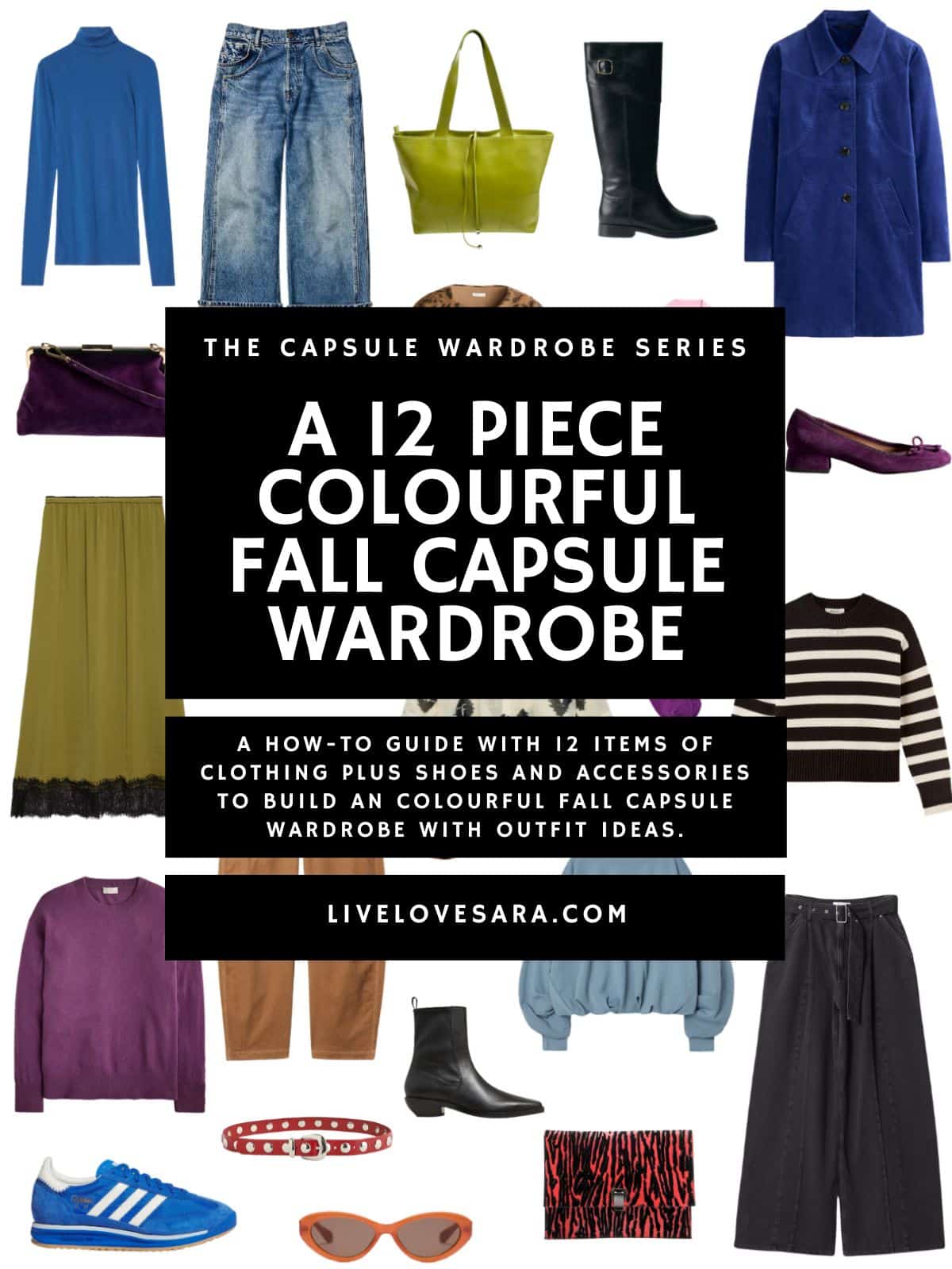
A 12 Piece Colourful fall Capsule Wardrobe
Blue Turtleneck | Jeans | Green Tote | Knee High Boots | Coat | Purple Heels | Pink Button Up | Animal Print Jacket | Loafers | Purple Handbag | Skirt | Cords | Print Button Up | Socks | Striped Sweater | Black Trousers | Sweatshirt | Clutch | Earrings | Ankle Boots | Sunglasses | Belt | Purple Sweater | Sneakers

Why should we try more colour in our wardrobe?
Embracing a more colourful wardrobe in the fall can feel like it is breathing new life into your style and the season.
Autumn is often associated with muted tones like browns, greys, and dark greens, so incorporating vibrant hues can offer a refreshing contrast to the typical fall palette.
Colours like rich mustard, deep burgundy, and bold jewel tones can uplift your mood, providing a sense of warmth and energy as the days grow shorter and colder.
But let’s not sleep on colours more attributed to spring like bright blues or pink.
Wearing colours isn’t about standing out, it is also great from a styling perspective because you can use it to highlight different layers and textures, which are key elements of fall fashion.
It also doesn’t have to be all or nothing.
You can still dress predominantly neutral and opt for bright footwear or accessories to brighten things up.
Just because you choose to wear a boldly colour-blocked outfit one day, doesn’t mean you can’t wear all black the next day.
I always say that style is a sliding scale depending on how you feel each day and if you fit colour onto that scale you will notice that some days will be more or less than others.
Try Using a Colour Wheel
This is something that I suggest often, but it truly is a game changer when you are trying to break out of a neutral comfort zone and aren’t sure how to actually wear more colour.
Just a cheapo version will do. Something that also shows guidance on complementary, split complementary, and triadic pairings.
We don’t need an artist’s version because we aren’t making paint colours so it wouldn’t be useful.
Amy Smilovic, the owner of Tibi has a book The Creative Pragmatist where she made her own version of the colour wheel that is based on the concept of pragmatic dressing. A term that she coined.
It is used to help guide you through your colour choices for that form of dressing.
I haven’t been able to get my hands on the book yet, but I hope to soon.
Understand the Basics of the Colour Wheel
The colour wheel is made up of three main categories:
Primary colours: Red, blue, and yellow. These colours are the foundation and can’t be created by mixing other colours.
Secondary colours: Green, orange, and purple. These are made by mixing primary colours.
Tertiary colours: These are combinations of primary and secondary colours, like red-orange or blue-green.
Complementary Colours: For Bold Contrast
Complementary colours are directly opposite on the colour wheel (like red and green or blue and orange). When paired together, they create a high-contrast, eye-catching look.
- A royal blue dress paired with an orange handbag.
- A green sweater with a deep red scarf.
These combinations can be harder to wear but they make a statement and are great when you want to stand out.
Analogous Colours: A Harmonious Look
Analogous colours are next to each other on the colour wheel (like blue, blue-green, and green). These colours are similar, so they blend well together, creating a smooth, cohesive look.
- A blue sweater with a green jacket and teal handbag.
- A purple top paired with a red skirt.
This is also known as a tonal look which uses multiple different colours that are within the same general colour family or tone, but it doesn’t focus on just one colour.
These outfits usually incorporate different colours that share a similar intensity, mood, or feel. The colours might be analogous on the colour wheel (like greens, blues, and teals), but they’re not just one hue.
A tonal look creates depth and subtle variation.
Tonal outfits are harmonious and cohesive, offering more variety in colour while maintaining a balanced and put-together appearance.
Example: A mix of earthy tones like olive green, tan, and beige, or different jewel tones like burgundy, deep purple, and navy.
This is a great approach when you want a more subtle and harmonious outfit that’s still colourful.
Monochromatic Colours: Sleek and Polished
A monochromatic outfit uses one single colour throughout the entire look, but it can include different shades, tints, and tones of that colour.
This creates a unified, sleek look. The key is that everything is a variation of the same colour.
- Light blue, medium blue, and navy all in one outfit.
- A pale pink blouse with a deep rose skirt and blush shoes.
This approach creates a sophisticated, cohesive look by playing with the intensity of one colour. It’s great for achieving an elegant, streamlined appearance.
Key Differences Between Monochromatic and Tonal:
Monochromatic: Focuses on one colour in varying shades, tints, or tones like all shades of blue.
Tonal: Focuses on different colours within the same family or intensity, creating a coordinated look but not sticking to one colour like earthy tones or jewel tones.
Both styles create visually appealing, cohesive looks, but monochromatic is more uniform, while tonal allows for more colour variation within a theme.
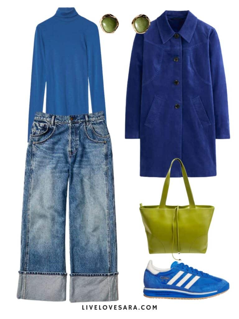
In the first look, we have an example of a monochromatic outfit using different tones, shades, and tints of blue. But by adding the green accessories we have moved into an analogous colour theme.
Two notes with this first outfit, first the sweatshirt is one that I tried on yesterday and it is such an interesting shape. It is one of those not-so-basic, basic pieces.
The hem is like a bubble hem but not as pronounced, and the sleeves have gathering giving them a cool cinched look. The jeans are great but I suggest sizing down one size, as they fit large. Also, if you are 5’4″ and under you will need the short version.
Short wasn’t available when I tried them the first time and they were way too long. Due to the large cuff you wouldn’t be able to get them hemmed very easily so the short inseam is the best option.
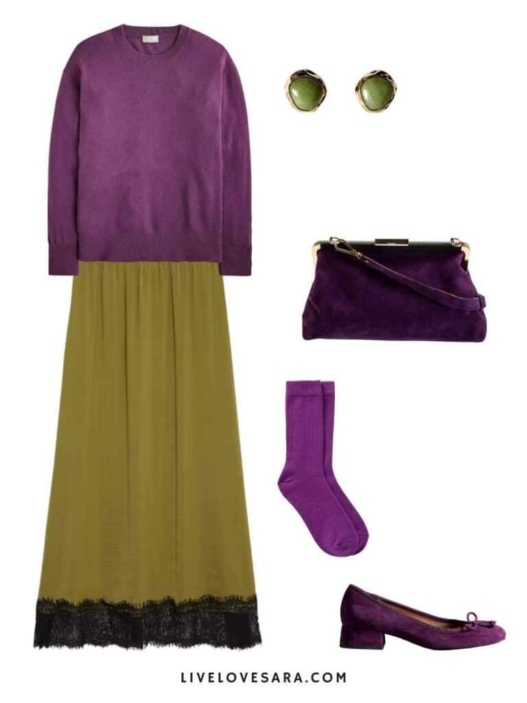
As for the second look, this is an example of a complementary colour theme as violet and green are considered opposites on the colour wheel.
Triadic Colours: Balanced and Playful Combinations
Triadic colours are evenly spaced around the colour wheel, forming a triangle (like red, blue, and yellow or purple, green, and orange). These colours create a balanced yet bold look.
- A yellow top, blue jeans, and red shoes.
- A green jacket with purple pants and an orange handbag.
Triadic combinations are playful but still harmonious, as the colours balance each other out without clashing.
Tetradic Colours: For Variety and Bold Statements
A Tetradic colour scheme uses two complementary pairs (like blue and orange, with yellow and purple). This approach adds variety and offers bold combinations.
Something like a purple dress with yellow shoes and a blue jacket paired with orange accessories.
This method allows for a diverse range of colours but can be more challenging to balance. Use one colour as the dominant tone and the others as accents to make it easier otherwise it can be overwhelming.
Using Neutral Colours
Neutral colours like black, white, grey, beige, and navy don’t appear on the colour wheel but are needed to keep your outfit grounded.
They work with any colour scheme and help balance out bolder tones.
- Pair a bold red blouse with camel trousers.
- Wear a colourful orange dress with a grey coat for a more subdued look.
Neutrals help you transition bright colours into a more wearable everyday wardrobe and is a really good way to introduce colour since most of us already have a great neutral foundation to work with.
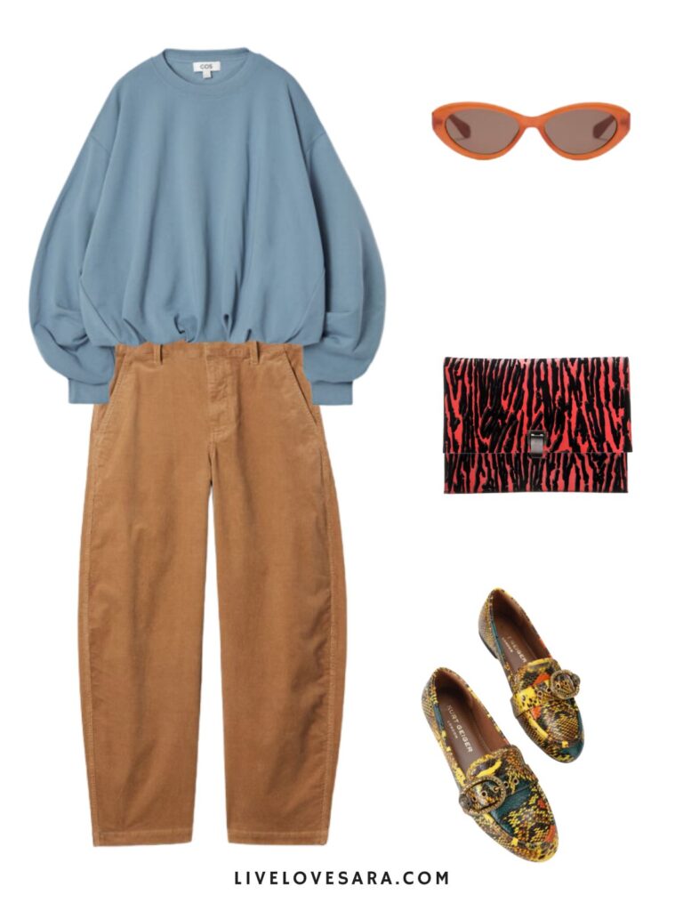
In look one it is an example of using a neutral to ground an outfit. Since the camel trousers are a significant part of the outfit it allows us to add larger variation of colours through accessories without it becoming too much.
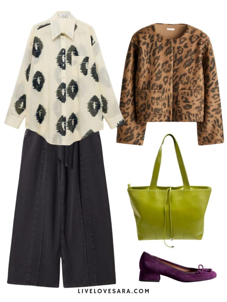
In the second look, it showcases using colour to add and accent to an overall neutral based outfit. We have some print mixing as well to add some visual interest. Both prints are considered neutrals which makes it more harmonious.
Yes, animal print is a neutral. When you accept that in your heart it will open up a whole new world of outfit options for you.
Accent Colors: For Small Pops of Colour
If you prefer a more neutral wardrobe but want to add colour, use the colour wheel to introduce these accents. Choose one or two bold colours to add as accessories like a bag, shoes, scarf, jewellery, and even socks or gloves.
- A navy outfit with bright yellow shoes (complementary colours).
- A white dress with a blue-green necklace (analogous colours).
Using colour accents keeps your outfit sophisticated while adding visual interest.
Seasonal Adjustments
You can also adjust your use of the colour wheel based on the season:
Fall/Winter: Opt for deeper, richer colours like burgundy, mustard, and forest green. Use complementary or analogous schemes with darker tones for a cosier, autumnal feel.
Spring/Summer: Go for lighter, brighter hues like pastel pinks, yellows, and blues. Try monochromatic or triadic schemes with lighter colours for a fresh, vibrant look.
Tips for Using the Colour Wheel:
Start small: If you’re new to experimenting with colour, start by using complementary or analogous colours for accessories or small pieces, like a scarf or bag.
Balance with neutrals: When using bold colours, balance them with neutral pieces to avoid overwhelming your look.
Test with prints: Patterns and prints often mix colours from the wheel, giving you a chance to experiment with colour schemes in a single piece.
I don’t want you to be scared of colour anymore. I want you to embrace it in ways that make sense to your personal style.
Start small and before you know it you will be able to confidently mix and match items without even thinking about it.
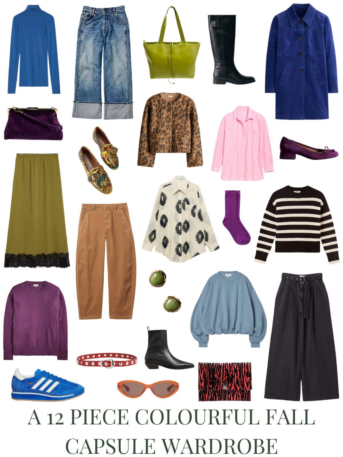
Colourful Fall Outfits for Women
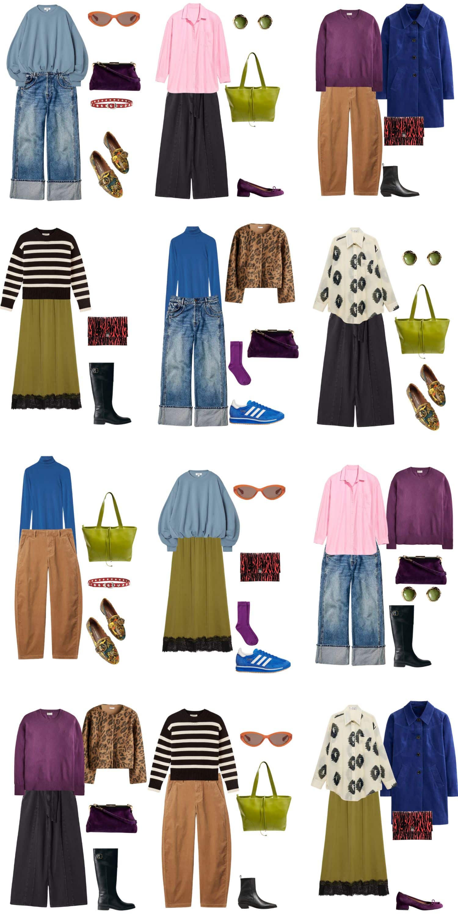

Blue Turtleneck | Jeans | Green Tote | Knee High Boots | Coat | Purple Heels | Pink Button Up | Animal Print Jacket | Loafers | Purple Handbag | Skirt | Cords | Print Button Up | Socks | Striped Sweater | Black Trousers | Sweatshirt | Clutch | Earrings | Ankle Boots | Sunglasses | Belt | Purple Sweater | Sneakers
You might also like:
A 12 Piece Eclectic Fall Capsule Wardrobe
A 12 Piece Fall Capsule Wardrobe on a Budget
A 12 Piece Minimalist Chic Fall Capsule Wardrobe
How to Create Your First Capsule Wardrobe in 5 Steps
12 Piece Preppy Fall Capsule Wardrobe
A 12 Piece Edgy Minimalist Fall Capsule Wardrobe
A 12 Piece Minimalist Fall Capsule Wardrobe
A 12 Piece 90s Minimalist Fall Capsule Wardrobe 2024
SHOP THE UK LINKS
This post contains affiliate links. By using my links to shop I may receive a small commission (at no cost to you). Thanks for supporting what I do 

Love, love the colors in this grouping.
Sadly the blue Boden jacket is no longer on their site.
I love the colours too. I bet you could find it secondhand. EBay would be your best choice because I bet someone in the UK has one for sale.